We had been working on our sketchbook for art. Drawing different things that describe and represent ourselves. Order than that, we also focused on "Pictogram", sharing ideas with our group and drawing different creative designs.
Most recently 7th graders worked on the board design which we used for our cultural fair.
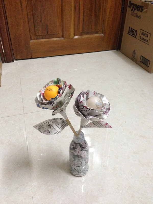
We also focused on making flowers and tiny trees out of stuff that are not usable, basically recycling them, and this is the flower i made:
______________________
For our first unit in grade 8 we focused on making art pieces out of recycled objects. Before we even started making out consumer portrait, we researched about one of the given choices of artist, to get a good understanding and ideas of different materials to use and how to make our portraits out of recycled objects. Here is the Artist Research document:
For our first unit in grade 8 we focused on making art pieces out of recycled objects. Before we even started making out consumer portrait, we researched about one of the given choices of artist, to get a good understanding and ideas of different materials to use and how to make our portraits out of recycled objects. Here is the Artist Research document:
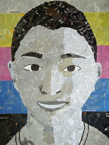
After getting a good picture in our head of what is expected, we then started our consumer portrait, we begun with drawing our faces, and it was done by first drawing squares on both the picture and the poster itself, the purpose of that is to help guide our drawings. Once that's done, we then started to choose the material to use, and start applying the them into the portrait. I used newspaper, and the reason for it is because newspaper has various colours I can choose from, which helped to not limit how I worked out the brightness and background.
Here is the final product of my consumer portrait:
Here is the final product of my consumer portrait:
Reflection:
Strength:
This piece of work shows that I did a fairly good job with apply what we learnt into the portrait, for example, the concept of putting colours from light to dark, I used it for my background, and it looks pretty decent.
Improvements:
If I was to do this work again, I would focus more on my drawing, getting all the details closely, so that the final portrait looks like me. I would also try to work on the shadow, so that the art piece look as realistic as possible.
